One aspect of late 20th century art, which seems to show up quite a bit, is the idea of playing with the viewer or using little tricks and riddles as part of the art. The artist might 'play' with the idea of switching foreground and background, mixing up the real and the artificial or the object and the subject. There are lots of different types of games the artist might play, but I think it's safe to say that much of the motivation for contemporary works consists of ideas that somehow plays with things we assume or take for granted about what art and life are. I even believe that such tricks, albeit subtler ones, go back much further than the 20th century. In some ways, those subtle riddles are probably a big part of what made all the masters great, and gave each of them a unique voice.
While I sometimes really love artwork that is playful in this way, I often find that some line is crossed, and I find myself getting annoyed with it instead. I'm not sure exactly what it is. Maybe it's that at a certain point it just becomes too kitschy or obvious. I think it might even be more than that. Maybe some sort of inconsistency or untruth. Might even relate to my own artwork, and the way that when I try to get too conceptual, I get finicky and too controlled. These are all hard to characterize, so I'll try to explain through some examples.
One example which I mentioned in a previous post was a performance I saw last week. It consisted of two men, sitting back to back inside a cage-like ball.
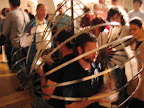 They were each continuously sketching what they saw on at every angle on small pieces of paper and then pasting those papers to the cage, thus blocking out the actual view of what they had drawn and replacing it with the sketch. This continued until they had completely replaced the actual world around them with the 2-D representations.
Now I actually did like this performance, but there was something about it that bothered me, so I guess it kind of sits on that line of mine. I think the idea was a really interesting one, albeit one that has probably been covered quite a bit. And it was executed quite well. It raised interesting questions about the nature of the art in relation to our perceptions and the real world - questions certainly worth thinking about.
My only reservation is that it was a little too obvious. This idea is a big one. It's important. It sits behind all of art, maybe even all of life. There's a lot to it. By being so literal about representing this idea, however, it's as if they were claiming to have captured or solved it. Sometimes, if you just hint at an idea as grand as this, you can get away with it. You're not claiming to solve any major philosophical problems, just pointing out that they exist, and maybe gesturing towards an interesting approach. But by addressing it directly and without a sense of humility in the face of such a heavy concept, they end up looking a bit foolish, like some 15 year old claiming to have figured out the meaning of life by coming up with a clever answer to the riddle about the rock that God can't move.
Another example is a work by a contemporary Chinese artist named Xu Bing that I saw at the Israel Museum exhibition of Chinese art. The work is called 'The Living Word' and it consists of colorful Chinese writing on a block on the floor. The last word on the block is the Chinese word for bird. That word is repeated over and over in the air, hanging from wires, emanating from the flat word.


Moving through the air, the word continually morphs, until it has taken the shape of an actual bird. Once again, part of me really liked this work. It's a nice idea and it was a visually interesting and beautiful display. Still there's something about it that feels a little bit cliche or kitschy. Maybe this is an idea that should appear in a TV ad for a bird company, where the digital animator would cleverly morph the word into the bird. Maybe it would have seemed more original in 1991 instead of 2001. There's just not much mystery in it. There are no holes to fill in, no questions left to be thought about by the viewer. The artist literally takes us step by step from letter to bird. It's such a literal interpretation of the connection between langauge and life, that once again, it seems to approach a big idea head on, trying to conquer it instead of playing with it.
I suppose that might be the type of inconsistency I mentioned before. On the one hand, these artists are approaching these very grand, very serious ideas. They're attempting to speak about issues that lie at the center of human existence. And yet, they are using little tricks and riddles to speak about those ideas. And not just to hint at, or play with the ideas, but to approach them fully and unabashedly trying to 'solve' them. Now I haven't yet read much about the artists, and maybe that will change my opinions a bit. Perhaps they are aware of this inconsistency, and that's part of their message. But, at least to me, it doesn't seem like there's a self-awareness of this problem. It feels a bit like they had a clever idea for a riddle, which sounded interesting, and pulled them along. Somewhat like a person trying to tame nature by chasing after a butterfly with a net, only to end up being drawn into the lion's den - they may have taken on more than they originally bargained for.
Now, as I said, I'm not sure these examples are such good ones, because I actually enjoyed both works more than most of the other art displayed at the same exhibits. But I guess I'm using them more as subtle illustrations of the type of tricks I'm speaking about. I hope you can see how the slight issues I have with these two works might translate into actually creating much worse artwork. Artwork that turns kitschy or cliched unintentionally. Artwork that reveals the artist's lack of self-awareness about the issues he/she is tackling and the methods being used. Artwork that gets so caught up in playing with a certain idea that the visual appeal suffers (uninentionally).
This is something that's happened to me a number of times in painting. I get an idea in my head of some concept I'd like to try to represent visually and the idea is so strong that it overtakes my ability to paint freely and well. Instead I get caught up in the idea itself and my painting becomes tight and finicky, instead of the freedom I've sometimes been able to display in my better paintings. Here, I'll put up a couple of examples. These are paintings that were originally intended to be part of the same series that I did last year in a painting class. My original idea was for a very conceptually driven series which would examine representation in art and technology. The first two painting I did were the still life and the i-pod.


They're not the worst paintings I've ever done, but they're certainly not the best. I was caught up in the idea I was trying to speak about, and my strokes are too controlled and the paintings get boring. As I continued to work on the series, I started to free up. My idea changed quite a bit, and the last three paintings strayed completely from my original idea, but by freeing myself from the constraints I had originally imposed, I ended up painting much more freely (which was way more fun) and also creating what I think are some of my best paintings.


Finally, I'd like to speak about one piece of 'tricky' art that I absolutely love - it's one of my favorites. There are many versions, but the one that I've seen is in sculpture form, and I think that the 3-D nature was an important addition. It's called 'Pitcher and Picture' by Roy Lichtenstein, and it's absolutely brilliant.

Part of what's so great about this piece is that it's playing with riddles on two different planes (once again I'll just put forward that I'm speaking completely from my own opinion and I could be totally off, but hey, that's why art is fun). The title is a completely silly trick. It's a play on words. It's just silly. 'Picture' and 'Pitcher' happen to be two words that sound similar in English, so why not put them together in the same work. It's fun and simple. No harm done, no big issues addressed.
But the much bigger problems and questions are all there, he just doesn't speak about them in the title. It's like some sort of meta-trick. He's tricking us into thinking that the issue he's addressing is the funny similarity in names given in the title, when actually there's so much more going on. There's a riddle here about flat art and 3-D art - viewing art as an object or a flat picture. This is a huge issue in 20th century art, and Lichtenstein subtly comments on it by creating the 3-D sculpture, which is displaying a 3-D scene, with depth (the picture is obviously behind the pitcher, and yet the actual sculpture is flat. The pitcher is not in front of the picture, they're on the same plane, taking up the exact same space.
There's an experiment with negative space - much of the sculpture is just the dark frame, and the white parts are actually just air, but those empty spaces are just as important to the composition as anything else. There's the important artistic idea of putting a frame within a frame. There is a 2-D picture contained within another piece of art - a classic commentary on the nature of representational art. And yet it's not actually contained at all. The picture is not inside another frame, it's as free-standing as any other frame hung on the wall of the museum. There are a bunch of other interesting riddles and games being played here. Many of them are brushing with important philosophical and artistic questions. And yet, Lichtenstein throws us all off track, portrays the work as a childish joke and shows us his true playful nature and the wonderful art it can produce.


No comments:
Post a Comment